The City of Forms
This is a link to a specific revision of this blog post, of which there are 2. Specifically, this revision was posted on 2023-04-20. To see all revisions, click here.
In the last little while I’ve been working on a game in RPG Maker MV. For various reasons I’m using the default tileset with some modifications, and in the process of making it I’m thinking about Space Funeral, a game that very much does not do that! What does it say about the ways that developers want their games to look, from indies to the prestige AAA, and how often should we take that advice?
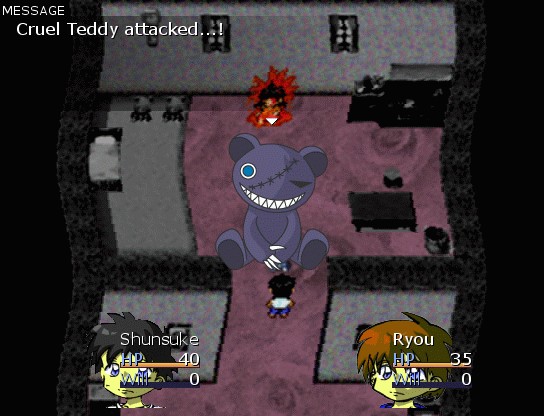
Space Funeral, like all games by thecatamites, is very uninterested in looking like a conventionally “good-looking” video game, even in comparison to other indie video games and even games made in RPG Maker around the same time. For example, here’s what you see after leaving your house:
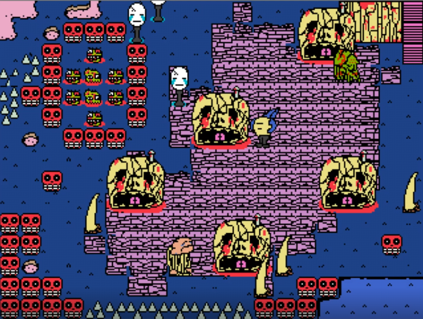
I don’t know enough about art to be able to describe it well in text, though one thing I won’t call it is “bad”. You might be tempted to, but I personally think the art style of Space Funeral is really charming and there’s very much intentional thought going into, among other things, keeping it consistent. Make sure you don’t fall into this trap!
Very early on a character talks about a perfect city, a “…divine construct from which derives all things in this world. All things are manifestations of this one thing.” Later it’s revealed to be called the City of Forms (and it’s easy to draw a parallel to the idea of platonic forms). At the end of the game, the antagonists talks about how witnessing this platonic form of the good destroyed him in its perfection, and then it is revealed to you… as a world made up by the default assets for RPG Maker 2003. Given these things, a lot of people have read Space Funeral as saying something about these default assets, one way or another.
Apparently the most common interpretation regarding this is (or at some point was) that yes, the RPG Maker default sprites are actually some kind of perfection when it comes to making RPGs in this style, and it’s hard to make assets that don’t clash with it let alone replace it. Obviously this is textual (the antagonist says it!) and it’s mentioned in the first question of an interview between thecatamites and the fan-blog “fuck yeah Space Funeral”. i also remember seeing the opposite interpretation when i first learned of Space Funeral, that the whole thing was just a kind of joke. The art style is what got eyes on Space Funeral in the first place, and yet it’s “imperfect” relative to the default assets that would cause it to blend into the background and fade into obscurity? “You’re full of shit, lmao” one might say if one was me circa 2015. “Just make art with some weird art style even if it isn’t conventionally good and it will be more interesting art because of that fact” was a sentiment I remember harbouring about this.
Within that interview, thecatamites mentions that most of the speculation about the quality of those default assets is “[assuming] a level of intention that I didn’t really have in mind at the time[…] It wasn’t so much about the sprites or art in particular of RPG Maker so much as a kind of classicist way of dealing with that stuff, which is like the idea that videogames reached their peak in the output of a few large companies in the 90s and ever since it’s all anyone can do to ape those things as closely as possible.” In other words, his intention is less “stop using default assets” and more “think about why you’re putting those a game looking conventionally good (for its genre) on a pedestal.” Having thought about this as time as gone on, and having worked on and successfully finished RPG Maker games, my thoughts on this have matured a lot, and while they do kind of align with what thecatamites says here I think there’s more that i can try to expand on.
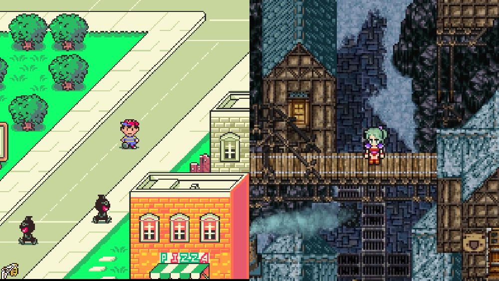
Firstly, I agree that its very important to not try to make things appear like any given “platonic form” of art just because you are making something that fits within it. But importantly, as thecatamites brings up, there is not just one “ideal video game aesthetic”. Just as AAA video game directors shouldnt be inching as close as they can to hyperrealism and the very specific look that “prestige” gaming has nowadays, developers of 2d RPGs shouldnt necessarily try to perfectly ape how final fantasy and dragon quest and what-have-you looked on the SNES. You might be tempted to relate this to the Brian Eno quote about how the limitations of a medium eventually become its appeal (he even mentions 8 bit video games in there) and sure, there is something charming about pixelated 2D graphics, but this also ignores that there were plenty of SNES and especially Mega Drive games that just didn’t look like that. Look at Earthbound! When we are attempting to emulate the look of the past, instead of using those aesthetics as inspiration and influence for something fresh, we’re missing out a little on the full potential of the kind of art we can make.
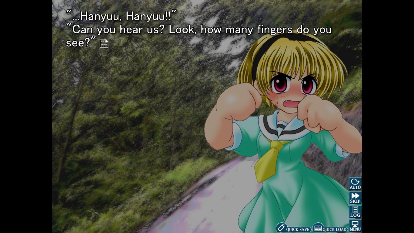
We can also apply this thought process to other genres of games, such as visual novels. Higurashi is the main example I want to draw on here. In the above screenshot, Satoko’s hand is drawn in a way that makes it hard for us to tell how many fingers she is actually holding up. This screenshot is pretty funny, but it’s a good illustration of my point. Ryukishi07’s art style here (and also in Umineko) is less “good” as in traditionally good, like perfectly generic bishoujo anime women, but it’s good in different ways: the original sprites in Higurashi and Umineko are much more expressive, and I reckon they have more character. It also allowed him to make the damn thing at all: sometimes you gotta do what you can well and be ok with things not being perfect for the rest.
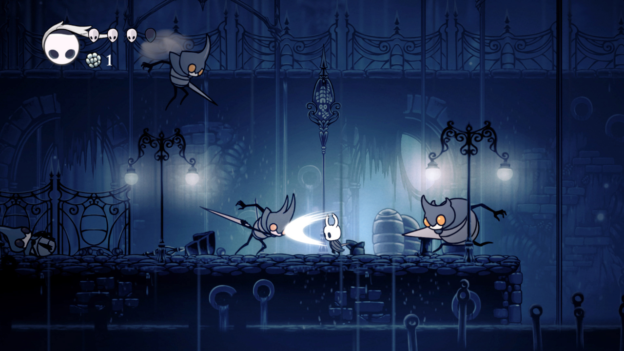
You can also see this “platonic ideal” of graphics at least a little bit within indie games as a whole, which as a definition is so broad nowadays as to be almost meaningless. Hollow knight is a good example, as that game was made by 2 people but still manages to look “good” in a way that we might hope that all indie games do. These games and Space Funeral are all considered “indie games” even though they are radically different and are going for radically different things, yet we’re still predisposed to talking about how beautiful hollow knight is. Its not as though this style is a platonic ideal in the same way that the prestige AAA game or SNES RPG are, as indie games are generally much more stylistically diverse. However, when we talk about good looking games, there’s a reason things pop in our head before Space Funeral (or something more contemporary that’s going for something less conventional, like cruelty squad or Cosmo D’s games).
The interesting thing about RPG Maker is that most of the games made within it are pretty stylistically diverse, even for indie games! I think there’s two reasons for this, the first being Yume Nikki’s influence (as an abstract looking game made in this engine with no combat or dialogue) on the RPG Maker scene as a whole, and the second being that so much of the engine is already taken care of (even if the engine is, in many ways, fucking dogshit doo doo ass) that it allows game developers like Kikiyama to make things like Yume Nikki in the first place with minimal programming if any is needed at all, which allows them to dedicate time to other things. Space Funeral is not alone in this regard: I could have talked about Hylics in this essay, for example, though I haven’t played it and I imagine it wouldn’t have matched as well. thecatamites mentions in that interviews that he hasn’t played a huge amount of games including things you might consider “canonical” to RPG Maker (for lack of a better term) like Yume Nikki, and I also remember reading an article by him (that I can’t find!) talking about engaging more so with high fantasy turn based Final Fantasy-esque RPG Maker games made by people on forums for fun, the kind of game RPG Maker markets itself as being useful for, instead of what actually ends up getting attention on the rest of the internet (OneShot, Yume Nikki, Lisa, Ao Oni, Omori, Hylics, etc.), so we should keep that in mind when he discusses what he sought to not repeat in Space Funeral.
Returning to the interview to talk specifically about the default assets: later on within it thecatamites mentions that “part of the intent was to show that these kind of slips and distortions and misinterpretations [of the formula] can be more interesting than the formula itself” and it’s clear that he’s not exclusively talking about graphics given that one of the examples he gives is someone using a metal song they like as a battle theme. To exclusively think about this kind of thing in terms of graphics is literally judging a book by its cover and prevents us from seeking out and finding other art that we may well enjoy or resonate with us. We can look at Re:Kinder by Parun as an example of this. It’s an RPG Maker game that uses default assets, albeit heavily edited in some places and not without other art original or otherwise, and for the most part the game received little to no attention. In her now-deleted video about the game, Hazel suggests that Parun using those default assets would have most likely turned people off from playing it in comparison to if he’d done something else. I think she’s right; I personally would have had no idea that it existed if not for her making a video on it and recommending it (or more likely, I probably wouldn’t have picked it out of the list of RPG Maker games that vgperson translated). In this game’s case it worked out, because people found out about it otherwise, and Parun made other games that rely much less heavily on those default assets and have much more distinct aesthetics in the future (see Heisei Pistol Show for example), but there’s likely many games which could be important and meaningful art and are completely unknown to anyone but who made them. To be clear I don’t think thecatamites is grappling with this in his answer to that question but it’s more something that I have thought about.
In practical terms, when it comes to making art and especially when it comes to something as complex as making games, we may not be able to do everything within any reasonable amount of time as solo developers or even in teams, and we need to take shortcuts. For some people, that shortcut is using the default assets. I am one of those people! The one RPG Maker game I finished was one that I made with a friend for fun and never intended to share with anyone beyond our friends. The one I’m making now is in the same boat, though I am making it myself, and mostly wont be distributing it anywhere beyond people I’m friends with because it uses a shitton of music I am not legally allowed to distribute with it lmao. My goals for it are a little different than if it was something I was gonna release publicly. There are things in it that I want to explore that aren’t served by going and creating/even using a completely different tileset just because its not the default, and the idea of dedicating time to that over the things I actually want to explore isn’t interesting.
So far in things that I’ve written I’ve intentionally not spent as much time worldbuilding as I could have because I’m more interested in writing characters and making them talk and interact and do things with each other. (maybe you can tell I read Homestuck when I was a teen!) using the default assets within RPG Maker works the same way: it gives me a very easy way of exploring these things in an interactive way that I wouldn’t get from other tools like twine or bitsy that are either non-graphical or very graphically lightweight. Can you make a useless time-wasting fishing minigame that accurately tracks “stats” with no benefit that all of your friends spend all their time in the game doing instead of actually fucking playing it? Maybe… but its different in RPG Maker, thats for sure.
I guess what I’m saying is: don’t make your game look a specific way because thats how you think the game has to look! And that can include looking like a AAA game, or like a game within the genre you’re working on, OR it can include making your own tileset because “the default assets are bad.” There is so much room out there for so many different types of videogame and if you’re a game dev it’s your sworn duty to make more and more types until everyone on planet earth gets overwhelmed and stops making any art altogether.
For what it’s worth I think there’s interesting things going on in Space Funeral outside of its art (I like that it has 2 party members and I think the mystery command is cool and the music choices are their own interesting artistic choices and it’s just straight up funny) and I have intentionally been vague about stuff outside of what I need to say so that you can go and play it for yourself. It’s like an hour and a half long and it’s free and worth your time!
